Fanduel Redesign
An audit was done on the Fanduel app, revealing usability issues such as confusing menu design, unnecessary navigation steps, and difficulty in locating account balance. Users experienced frustration with backtracking and deleting bet selections. A proposed redesign aims to enhance differentiation between promos and games, streamline navigation, improve layout, increase visibility of account balance, optimize backtracking, and provide a user-friendly method for removing bet selections. Overall, the redesign aims to improve user experience and usability.
Client:
Fanduel
Role:
UX/UI Designer
Year:
2023
Introduction
In this case study, I conducted an app audit to identify usability issues within the FanDuel sports betting app. With a focus on improving user experience, I aimed to address key pain points and enhance the overall usability of the app.
Context
FanDuel is a popular sports app that offers a wide range of sports betting options, allowing users to predict outcomes in various games, including basketball, football, and hockey.
Task and Audit Insights
Users were tasked with placing a $1 bet on a specific game scenario and then deleting their selection.
Insights from the audit revealed several usability issues, including confusion in distinguishing between promos and games, difficulty in navigating to bet selections, and challenges in accessing account balance.
Problem Statement
The process of placing a bet is confusing for both new and existing users, impacting their overall experience with the app. Users encounter difficulties in differentiating between promotions and games, leading to frustration and making it challenging to successfully place a bet.
Vision Statement
The redesign of the FanDuel app aims to enhance accessibility and provide users with an easier way to place bets. By improving visibility and streamlining the user interface, the updated design will simplify the betting process and create a more user-friendly platform for bettors.
Themes, Epics, and User Stories
Theme: Enhancing user experience in sports betting
- Epic: Straightforward betting options
- User Story: As a casual bettor, I want to explore available game options easily to make a bet selection.
- User Story: As a casual bettor, I want to place a bet knowing the process is straightforward and easily manage my selections.
Theme: Promos tailored to betting history and live betting experience
- Epic: Promos with live betting updates
- User Story: As a returning user, I want to receive personalized promos based on my betting history for a more valuable experience.
- User Story: As a returning user, I want to easily explore and take part in live betting opportunities for a dynamic experience.
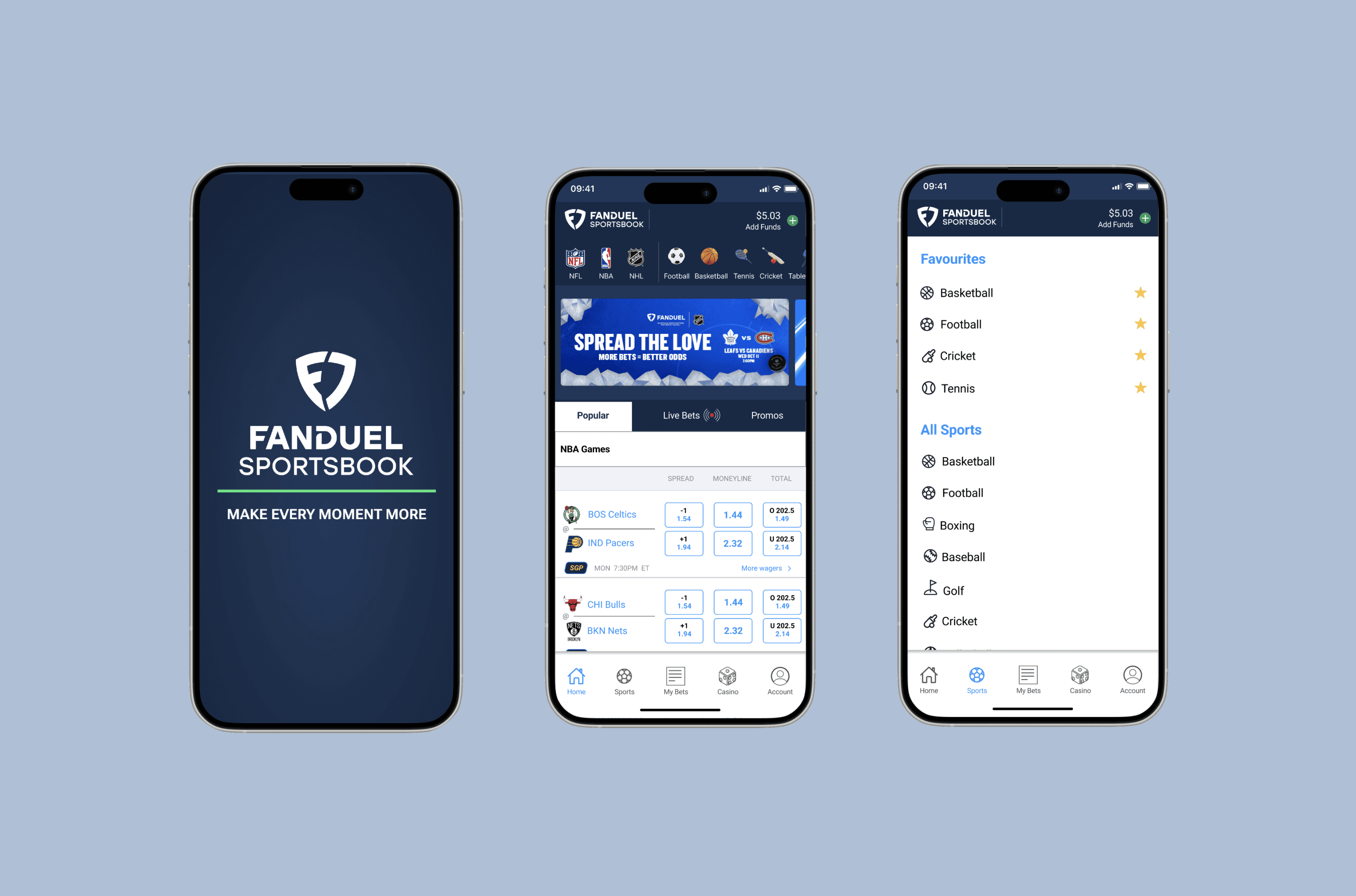
Redesign Screens
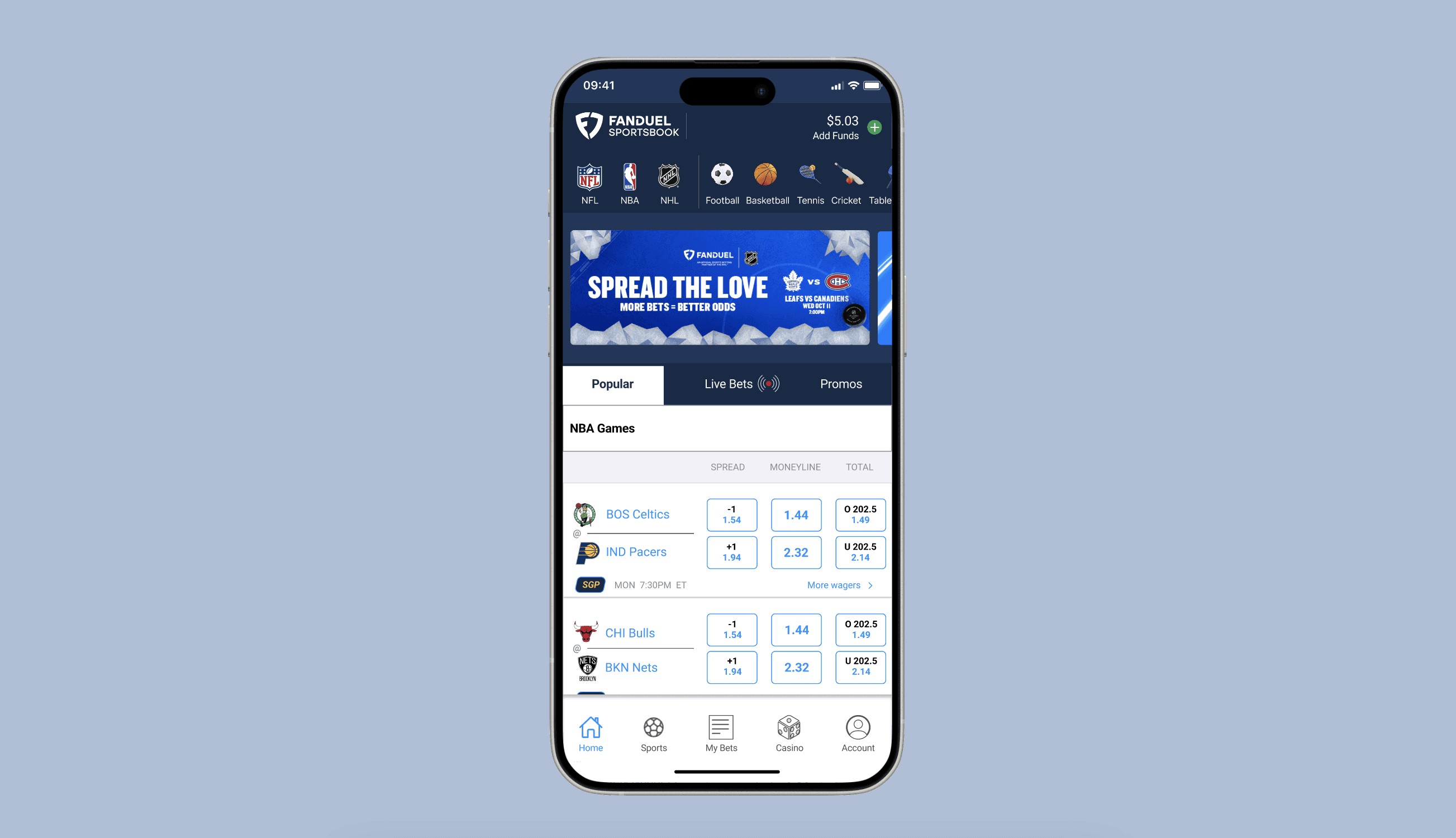
1. Home Screen:
- The redesigned navigation bar features major sport leagues and favourite sports for a personalized experience.
- Live bets, promos, and popular games are conveniently accessible in a mini bar for a dynamic betting experience.
2. Wagered Amount Screen:
- User's balance remains visible at all times to ensure a clear financial overview.
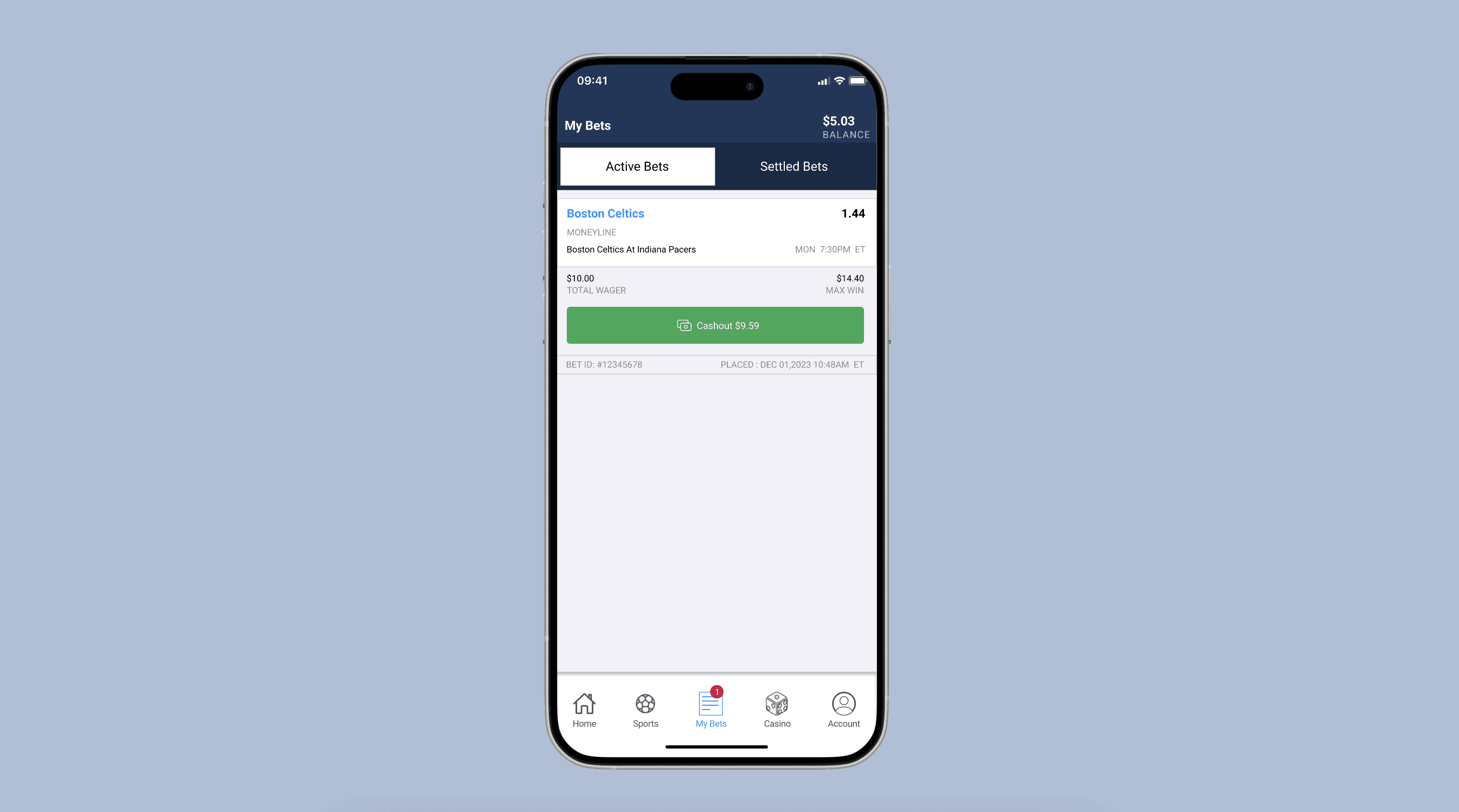
3. Betslip Screen:
- A notification badge indicates the number of active bets for enhanced user awareness.
- User's balance is consistently present for easy reference.
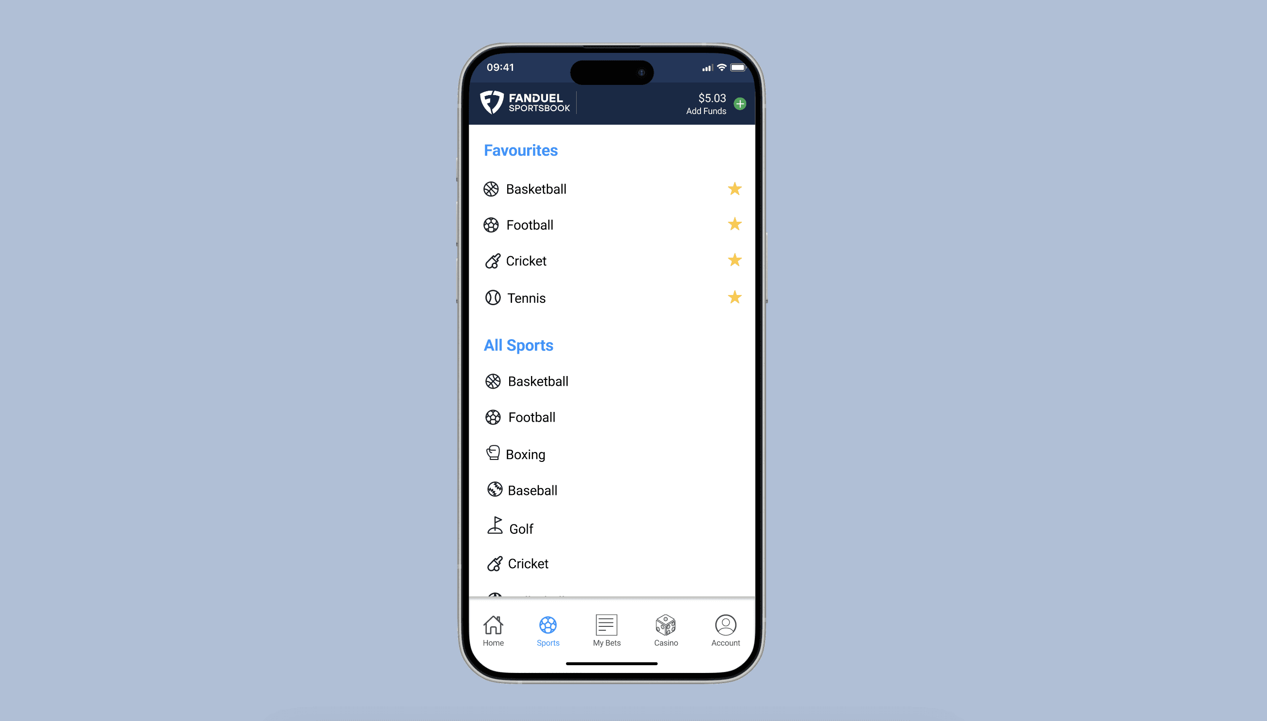
4. Sport Selection Screen:
- Users can pick their favorite sports for a tailored experience.
- This selection reflects directly on the home screen's sport navigation bar.
5. Live Bet Notification:
- Users receive real-time updates on live bets directly to their phone's lock screen for increased engagement.
Conclusion
This redesign aims to create a more intuitive and user-friendly platform, enhancing the overall sports betting experience for its users.


